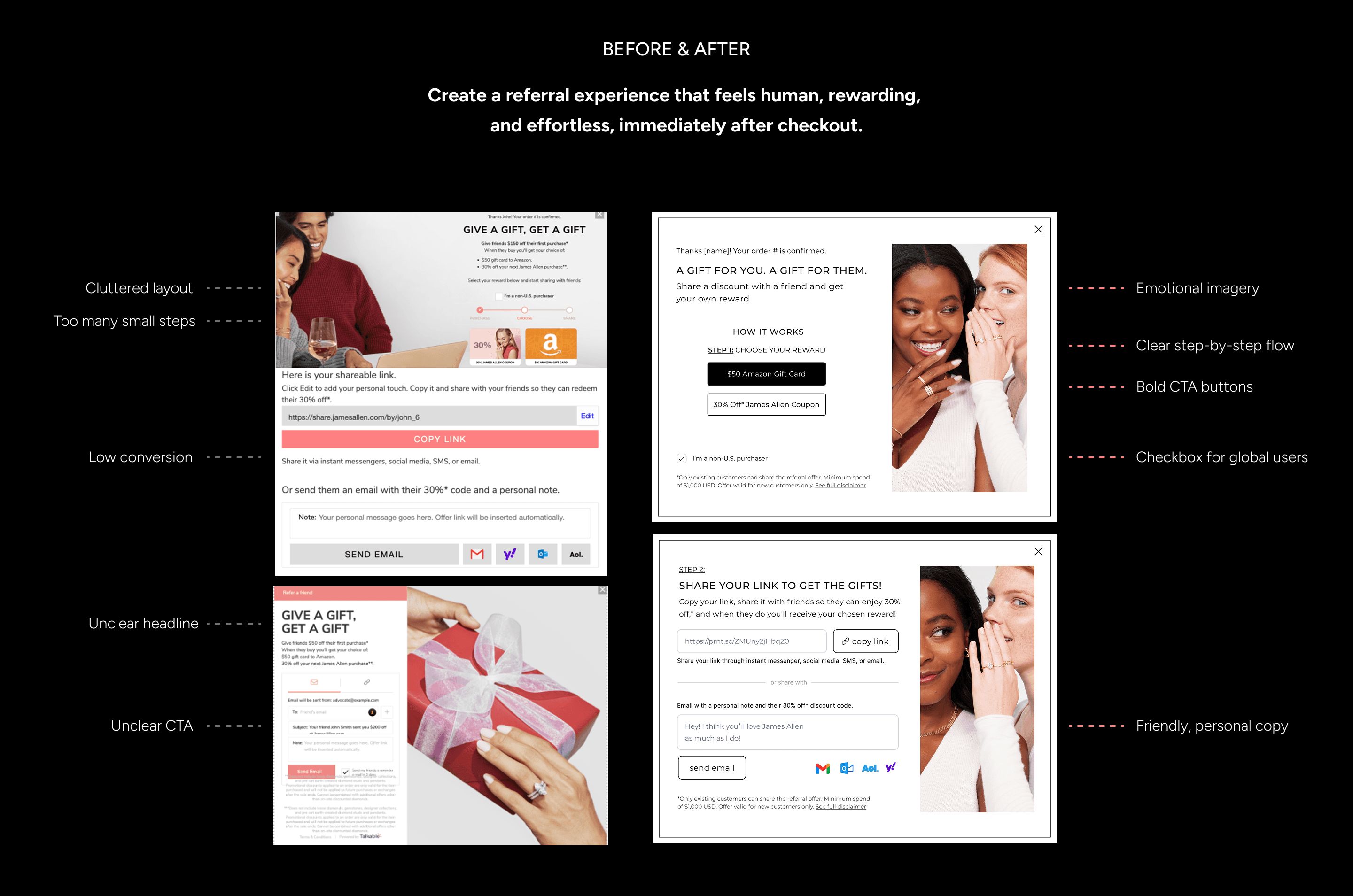
Design Actions
Replaced generic visuals with a warm, personal photo of two women sharing a secret
Used clear contrast and bold CTA buttons to emphasize the reward selection
Simplified the flow to 1 clear step before share
Added checkbox and clarification for non-U.S. users
Optimized for mobile-first readability and clarity
Impact
+35% sign-up rate increase
Higher email share rates
Improved perception of brand generosity post-purchase
My Role
Full ownership of redesign
A/B tested variants with CRM team
Delivered dev-ready components for implementation
Why It Worked
Because referrals are emotional.
People share moments, not just coupons.
We made the referral feel like a gift not a promotion.

James Allen the largest online diamond retailer globally